Interactive design
Interactive solar systems: why Earth disappears at true scale
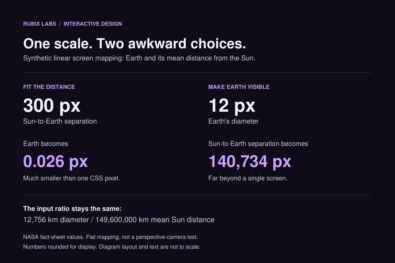
Say you're building a solar system people can spin around and explore. You give Earth's mean distance from the Sun 300 CSS pixels, apply the same scale to the planet itself, and get an Earth about 0.026 pixels wide. Good luck selecting that with a thumb. At Rubix, we'd decide what the view needs to teach before choosing how much to enlarge it.
Start with 300 pixels from the Sun
For this example, we're mapping kilometres directly to CSS pixels on a flat plane. No perspective camera, zoom or orbital simulation. NASA's fact sheet gives Earth an equatorial diameter of 12,756 km and an approximate mean Sun distance of 149.6 million km. Those two measurements have to share the same multiplier if we want one true linear scale.
Our multiplier is 300 divided by 149,600,000 pixels per kilometre. Apply it to Earth's diameter and you get 0.02558 pixels. Jupiter fares a little better at 0.287 pixels, but its mean distance from the Sun now occupies about 1,561 pixels. Neptune sits roughly 9,054 pixels away. These are centre-to-centre distances, not orbit diameters.
We checked those conversions locally with decimal arithmetic, including that the diameter-to-distance ratio stays unchanged. The table rounds diameters to three decimals and distances to whole pixels. It's a calculation using published values, not a browser performance or usability test.
| Body | Equatorial diameter | Mean Sun distance | At our screen scale |
|---|---|---|---|
| Earth | 12,756 km | 149.6 million km | 0.026 px wide; 300 px from Sun |
| Jupiter | 142,984 km | 778.5 million km | 0.287 px wide; 1,561 px from Sun |
| Neptune | 49,528 km | 4,515 million km | 0.099 px wide; 9,054 px from Sun |
Making Earth bigger moves the Sun a long way off
Fine, let's make Earth 12 pixels wide. Keep that same physical ratio and its mean separation from the Sun becomes about 140,734 pixels. You can preserve the scale by letting people travel through a very large scene. You just won't have a handy overview where every planet is easy to see at once.
If the point is to compare sizes, put the planets side by side with one shared diameter scale. For an orbit overview, you might compress the spacing and enlarge the bodies. Put that choice on the view: 'sizes enlarged; spacing compressed' tells the reader which comparisons the picture can't support.
We'd keep the physical data separate from the drawing choices: diameter and mean Sun distance in kilometres, display radius and orbit spacing in scene units. Changing a mesh to make it visible mustn't change the diameter shown in its fact panel. If a lesson promises a true size comparison, it needs its own consistent size scale; decorative planets won't do that job.
What we chose for Rubix's Solar Explorer
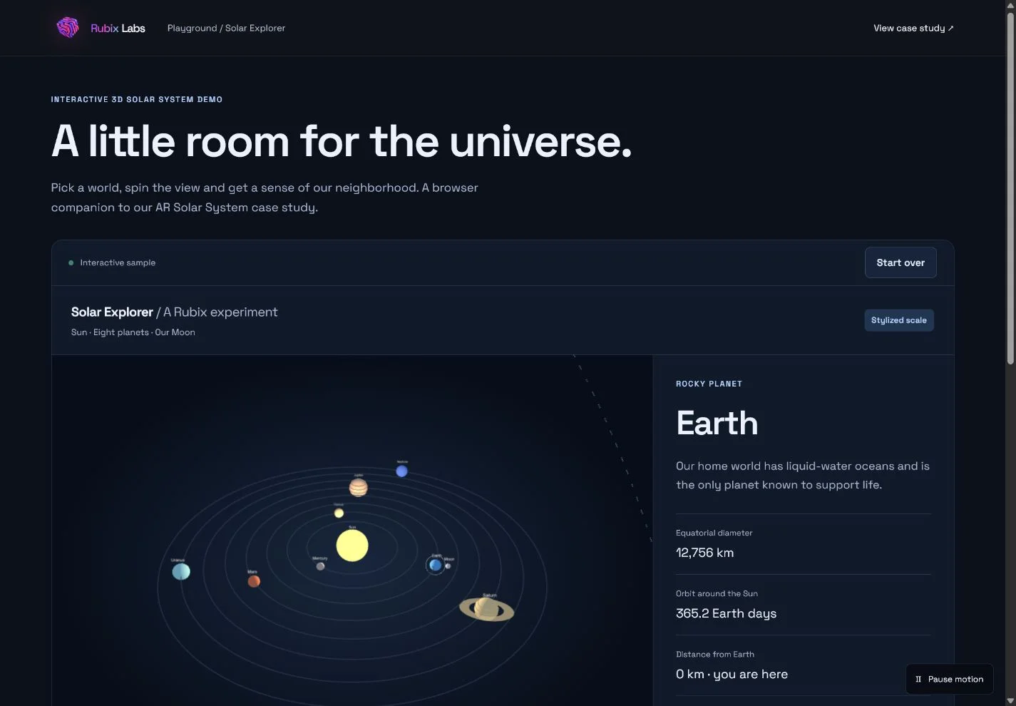
Our public Solar Explorer uses enlarged bodies and compressed spacing so visitors can move around the scene and select a planet. The 'Stylized scale' label is there for a reason. The fact panel gives the numerical measurements; the scene provides a way to explore them. The new calculation above is separate from that demo.
There's another distinction in the distance panel. Its planet-to-Earth ranges use a simplified circular, coplanar orbit model. They aren't today's actual distances. The orbit motion is illustrative too. A product that needs positions for a particular date would need an ephemeris, a defined time and a stated reference frame, rather than treating this teaching model as a sky map.
The browser version uses Three.js. Our original AR Solar System portfolio project used Apple ARKit to place the system in the user's environment. They share the learning subject, but this web demo doesn't reproduce that app's AR placement.
A planet doesn't have to be its own only button
Even a visible planet can be awkward to catch when it's moving. Solar Explorer has a row of named body buttons alongside selection in the scene. Those buttons give keyboard users a stable route to the same information, and they still work if the browser can't display the 3D scene.
The visual radius and the selection area are separate design decisions. You can enlarge a hit area, but neighbouring targets must stay distinguishable. W3C's target-size guidance describes a 24 by 24 CSS pixel minimum for pointer targets, with specified exceptions including spacing and equivalent controls. A large-looking 3D object doesn't by itself establish that the interaction meets that criterion.
A useful check is to select Earth, switch to Neptune, read the values and return to the overview. If that only works with a mouse on a large monitor, there's more work to do. We'd repeat it with a keyboard and on a narrow screen, then check that the text remains available when WebGL fails. Pause controls and reduced-motion support also let people read without chasing an orbit around the screen.
Bring us the tricky interaction
Try picking a few planets in the Rubix demo. For your own project, the awkward bit might be a component hidden inside a product, or a measurement that's hard to explain in a flat picture. Bring us that example. We can help work through the data, camera and controls for an educational explorer or product viewer, with a prototype you can actually try before committing to all the visual detail.